
First, Let’s Talk About Why Brand Matters
A brand is an equation made up of two things: your identity (who you are) + your story (what you stand for).
For the purposes of this brand site, we’ll mostly stick to the identity side—logo, colors, fonts, imagery, iconography, voice, tone, details and will add this massive, hulking asterisk: EVERYTHING IS BRANDING.
“Everything?” you scoff. “Yes. Everything.” Marketing, as expected, but also sales, product, support, print, events, websites, landing pages, handshakes, the lobby, innovations, emails, t-shirts, stickers, trade shows, social media, Glassdoor, LinkedIn, Reddit, the bathrooms, the breakroom…everything. Every single point of contact between Canopy and our audience is branding. Which means, no pressure, but every single interaction either builds or destroys brand equity. So, yes, brand matters. A lot.
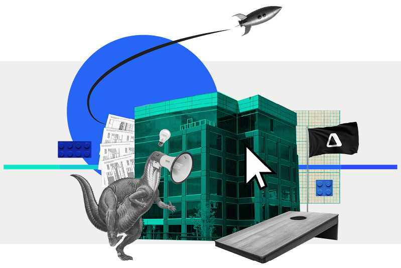
Our Visual Identity
A company isn’t a person, but it does have a personality— that’s what the brand is. It’s our style and distinct way of talking. It exists so people have something they can relate to when they interact with our company.
Canopy’s personality is fresh, confident, and perceptive. That should reflect both in our design (this document) and the way we talk (see voice and tone document).
The rules and guidelines in this guide aren’t meant to restrain creativity, but exist so we can create a consistent experience for everyone who interacts with Canopy. The more consistent we are in our design and messaging, the stronger and more recognizable our brand becomes so Canopy can become a refreshing beacon of clarity in a complicated industry.
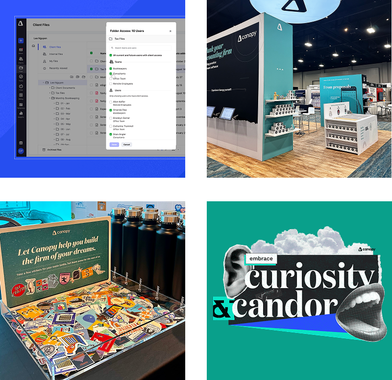
Logo
Our logo is our rallying banner. It represents both Canopy the brand and the company. Because of that it deserves all the respect and love we can give it.
Behind the Delta
Our identity is centered around the idea of quantifiable change. We represent this through our official delta mark. We are committed to adding quantifiable change to accounting firms and their clients by continually adding to and improving the Canopy experience. Delta is difference. And that’s what we want to make in the accounting industry.

Space & Placement
Don’t crowd the logo. Like any good relationship, our logo needs some space, some room to breathe. Separate our logo from all surrounding visual elements using a clear-space margin that’s the same width as the ‘n’.
Measure the size of our logo from the top and bottom of the delta mark. The minimum size of our logo is 21px on screen or 0.25in (6.35mm) in print. On rare occasions, smaller sizes for print may be necessary. Legibility is always a priority.

Usage Examples
HORIZONTAL
This mark is our primary use logo. Ready to use on external facing collateral.
STACKED
This mark is our secondary use logo. Ready to use on external facing collateral.
DELTA MARK
Only use this mark alone if the company name is somewhere else in the piece.
Typography
Two typefaces define our brand, use them together or separately to provide varying tones in design.
PRIMARY TYPEFACE
How to use Domaine Display NarrowHeadline
Leading: +10 | Kerning: Metrics | Tracking: 0
Quotation
Regular, sentence case, 38/52
Leading: +14 | Kerning: Metrics | Tracking: 0
Our primary typeface is Domaine Display Narrow. It may be used for body copy, headlines and sub-headlines. It is important to note, there are two Domaine typefaces: Domaine Display Narrow and Domaine Display. Domaine Display is reserved for use in regular weight or italic.
If Domaine is unavailable please use Playfair, available for download here.
Size & leading
Domaine is a high contrast typeface that should be used with generous leading (line spacing).
Secondary TYPEFACE
How to use Work SansHeadline
Leading: +10 | Kerning: Metrics | Tracking: 0
Subhead
Leading: +8 | Kerning: Metrics | Tracking: 0
Descriptor
Leading: +8 | Kerning: Metrics | Tracking: 80
Body
Leading: +9 | Kerning: Metrics | Tracking: 0
Color
Our palette is vibrant and bold. The brand carefully utilizes a range of colors and gradients to bring a modern edge to our designs.
Palette
We use a wide palette, but we use it carefully so we can add pop without overwhelming the viewer. Canopy’s primary brand colors are blue and aqua green and should be used when promoting Canopy as a brand followed in advertising or other designs.
Primary Palette
Secondary Palette
CTA Palette
Color usage
Our color palette is designed to make an impact. You will see more saturated use in social media and advertising, while the website maintains a more restrained approach. We can accomplish this using the same palette in different doses.
You’ll notice a yellow in the palette that is named Button Yellow. This is to be used as the name suggests: for CTA’s and buttons to create contrast and visual impact. Button Yellow is not to be used in large swaths, as a primary text color, or as anything other than an accent for CTAs.
website
social media & advertising
Illustration
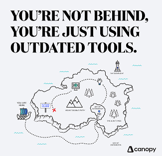
Since what we do isn’t a physical thing we can take photos of, illustration is one of our best methods for visualization. Our approach to illustration is bright and linear. Illustrations are geometric in nature and created with scale, color, texture and composition in mind.
We often use illustration to recreate graphs to display data in a more interesting way. Illustration can be used for infographics, data, video and icons.


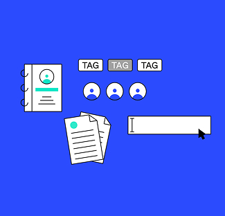

Icongraphy
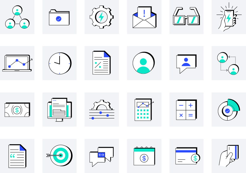
Yes, our icon style. It’s beautiful, isn’t it? Icons can be such a simple and effective way to illustrate ideas, create categorization, and bridge the understanding gap.
These are custom-to-Canopy icons to be used only on Canopy branded collateral and presentations.
Product Images
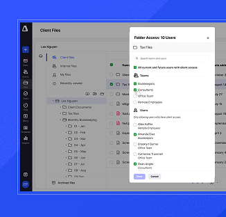
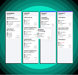
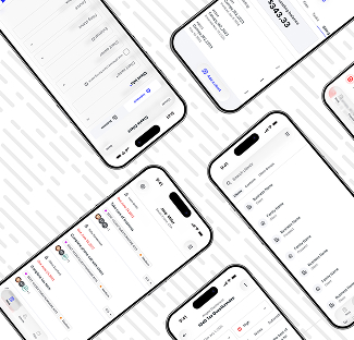
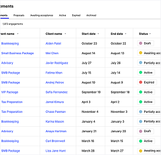
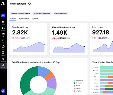
We love to show off what we do. Screenshots of software can get boring and confusing so we do our best to 1) have amazing looking modules to begin with and then 2) serve the visuals and ideas to you in ways that actually make sense. Our whole goal is that our customers can easily understand what exactly they are getting themselves into.
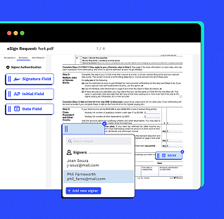
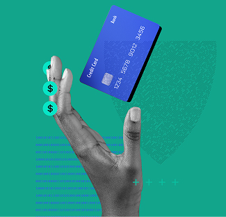
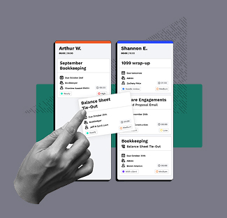
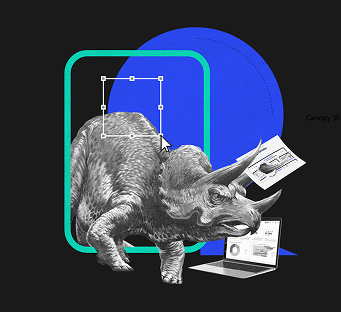
Collage
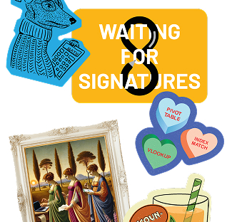
Yet another “illustration” method that we employ to create variety and unique points of view in our imagery.


Canopy Brand AI Usage Guideline
AI is amazing. It’s also not infallible — so let’s use it wisely. This section is packed with brand tools (voice guidelines, structured brand data, sample prompts) built to help your AI outputs actually sound and look like Canopy, instead of generic AI-flavored mush. Use them liberally.
A few ground rules: always run your AI-assisted piece through the checklist below before calling it done, and if something was produced solely by AI and you’re about to publish it publicly, loop in Marketing first. We’re not trying to slow you down — we just want a human to give it the once-over before it goes out into the world wearing our name.
AI Visual Output Checklist
Before using an AI-generated image, graphic, or design element, check that it:
- Doesn't recreate or distort the Canopy logo, wordmark, or icon (Often it will make the delta a solid triangle or move the inner triangle to a new spot. Don’t let it.)
- Uses brand-approved colors (or close enough that it isn’t glaringly obvious)
- Doesn't include fake or garbled text, UI elements, or product screenshots
- Looks intentional, not "obviously AI" (weird hands, melted objects, uncanny faces; you know that mirage, blurry looking stuff when you see it)
- Doesn't depict real people, competitors, or anyone's likeness without permission
- Matches the mood/style of our existing visual brand (not generic stock-AI aesthetic)
- Has been reviewed by a human before it goes anywhere public
- No really, make sure it is reviewed by a human.
AI Documents
AI Markdown File (llms.txt)
This is Canopy’s structured brand summary written for AI tools to read — think of it as our “about us” page, but formatted so LLMs and AI crawlers can quickly find accurate facts instead of guessing. Drop it at your site’s root as llms.txt and AI tools that support the standard will pick it up automatically.
Canopy Voice & Content Guidelines
Everything you need to know about how Canopy sounds, from our core voice principles to what to avoid, structured so you can paste it straight into an AI tool as a system prompt. Use it any time you’re using AI to draft content and want it to actually sound like us.
Canopy Visual & Generative AI Guidelines
Use this document when generating images, graphics, or other visual content with AI tools on behalf of Canopy. Pair it with the AI Visual Output Checklist (above) to review what comes out the other end.
Guardrails
Here’s the deal: anything public or external that represents the Canopy brand — landing pages, social posts, ads, sales decks, anything with our name on it that lives outside these four walls — needs to follow the brand guidelines in this section, no exceptions. And if it’s going to stick around (not just a one-off), it needs a Marketing thumbs up before it goes live.
Internal stuff (Slack graphics, that one deck for the team offsite, your notes doc) should still follow these guidelines when it makes sense, but doesn’t need a formal review. Use your judgment.
One rule that applies to everyone, everywhere, always: no hot pink. Or Comic Sans. Or both. We’re begging you. 😉
Sample Starter Prompts
Example prompts for using AI tools to draft on-brand Canopy content. Each pairs with canopy-voice-and-content-guidelines.md and llms.txt — attach or reference both when using these prompts so the model has full brand context.
Blog Post (Thought Leadership)
Sample Prompt (Use This to Get Started)
You are writing a blog post for Canopy, an all-in-one practice management software for accounting firms. Follow the attached Canopy Voice & Content Guidelines.
Requirements:
- Open with a 3–6 sentence intro that gets to the point immediately
- Deliver one clear takeaway per section
- Write as a confident guide — moderate technical detail, not oversimplified
- Cite any stats or claims to a reputable third-party source published within the last 3 years, with inline links
- Do not force the target keyword into sentences where it doesn't fit
- Do not refer to Canopy as "Canopy Tax" or imply it only serves tax firms
Marketing Email
Sample Prompt (Use This to Get Started)
You are writing a marketing email for Canopy. Follow the attached Canopy Voice & Content Guidelines.
Requirements:
- Write to one person, not "your business" — use natural, spoken language
- Lead with the single most important thing the reader should do or know
- Short, direct sentences; minimal jargon
- One clear call to action
- Subject line under 50 characters
Social Media Post
Sample Prompt (Use This to Get Started)
You are writing a LinkedIn post for Canopy. Follow the attached Canopy Voice & Content Guidelines.
Requirements:
- Hook in the first line — assume readers won't click "see more"
- One clear idea, not multiple points crammed together
- If citing a stat, name the source inline (only name the study/publication if it's well-known; otherwise refer to it generally, e.g. "a 2024 survey")
- No forced hashtags or keyword stuffing
Landing Page Copy
Sample Prompt (Use This to Get Started)
You are writing landing page copy for a Canopy product feature. Follow the attached Canopy Voice & Content Guidelines.
Requirements:
- Headline should communicate the single biggest benefit, in plain language
- Subhead adds just enough context — don't over-explain
- Body copy educates on the capability without assuming the reader is already a Canopy expert
- Avoid superlatives or claims that aren't backed by cited evidence (e.g., no "the best" or "#1" without a source)
- End with one clear CTA
Support / Help Center Article
Sample Prompt (Use This to Get Started)
You are writing a help center article for Canopy. Follow the attached Canopy Voice & Content Guidelines, adjusted for a support context.
Requirements:
- Tone is more direct and instructional than marketing content, but voice stays consistent (confident, perceptive, no fluff)
- Lead with what the reader will accomplish, in one sentence
- Use numbered steps for any process
- Avoid marketing language ("game-changing," "revolutionary") — this is a practical reference doc, not a pitch
- Flag anywhere a screenshot or visual would help, but don't generate one
Sales Outreach Email
Sample Prompt (Use This to Get Started)
You are writing a cold outreach email from a Canopy sales rep to a prospective customer. Follow the attached Canopy Voice & Content Guidelines.
Requirements:
- Personal, human tone — write to this one person, not a generic "firm"
- Lead with their likely pain point, not a feature list
- Keep it under 120 words
- One clear, low-friction ask (e.g., "worth a 15-minute call?")
- No exaggerated claims about outcomes or results without attribution
- Do not imply Canopy is tax-only — mention the relevant practice area for this specific prospect (CAS, bookkeeping, audit, tax, etc.)
Templates & Assets
Slide Template
Here lies our *internal only* Google Slides template. Please make a copy of it in order to edit instead of requesting edit access to ensure that the template remains a template.
Go To TemplateLetterhead
Same for our letterhead. Please make a copy of the google doc in order to edit instead of requesting edit access to ensure that the template remains a template.
Go To TemplateDocument Template
Have you ever thought, “I’d really like to make a super nice-looking Canopy document but I don’t have a template”? Well, think that no more! Make a copy of this document and you’re on your way.
Go To TemplateEmail Signature
Emails, emails, emails… we have to send them! And we might as well all look like a team when we do. Use this guide to make your Canopy email signature match.
Go To TemplateLinkedin headers and images
If you’d like to rep Canopy on Linkedin, here is a folder full of banner image options!
Go To FolderContent playbook
This document provides all the resources and guidelines for writers and marketers to produce on-brand content and copy that will bring the Canopy brand to life. In this document, we’ve included both universal copy guidelines and content creation guidelines to quickly orient writers, editors, and managers, and other stakeholders to the goals and requirements of the content they’ll be producing and reviewing. This document should be read in conjunction with Canopy’s in-depth persona frameworks.
1.
Provide insights, best practices, tips, & updates to establish Canopy as the main thought leader in the cloud-based accounting industry.
2.
Educate customers and prospects about the Canopy platform and capabilities in a masterful yet digestible, easy-to-understand way.
3.
Position Canopy as a go-to source for expert services and specialized knowledge for the key buying personas we’ve identified.
Voice & Tone
When it comes to speaking to our audience, we want to convey that we’re talking to actual humans (rather than businesses as a whole) about issues that are important to them and relate to their work. We should write the way we speak. This doesn’t mean sounding informal — this means following common patterns of speech. Write to an individual. Use words that people understand and avoid word speed bumps that slow reading. We can do this and still educate our audience on critical industry terms and product specifications. The voice of the Canopy brand will never waver — however, the tone we speak will vary based on who we’re speaking to, as well as their priorities, and roles and responsibilities.
DO:
Streamline each sentence so that it offers a clear takeaway for readers — what is the most important thing we want them to learn or do?
DO:
Use short, direct sentences whenever possible. Offer just enough color to provide context and make communications feel personal, but don’t over-explain.
DO:
Long-form content: Strong intros pull readers in quickly and get to the point. Ideally, your intro sets up the story in 3-6 sentences, not 3-6 paragraphs.
YOU ARE THE CONFIDENT GUIDE—SOUND LIKE IT
Our audience knows their industry but knows how convoluted it can be—they trust you to field questions, lead the way, and assuredly navigate to solutions. Use technical details moderately. Go too light and risk losing credibility, but go too heavy and you’ll overwhelm or bore readers. Whenever we create new content, it should deliver on at least some (but not necessarily all) of the following:
- Add perspective on a trend and bring in a new angle to the conversation.
- Give access to Canopy’s thought leaders and trusted suppliers
- Showcase outside expertise from thought leaders and trendsetters
- Present data and new research with a clear narrative/takeaway
- Educate readers on a new (or improved) way to do something
- Share best practices that help readers improve their practice management
- Provide insights and tools for doing their jobs better or more efficiently.
Content Creation
SEO-BASED IDEATION
To ensure that the content is relevant, useful, and strategic, internal expertise will inform the keyword research strategy.
IDENTIFY DEMAND
Content creators will work with the Canopy SEO team to assess a data-driven keyword strategy. This will help us understand which topics to cover at each level, from high, to middle, to niche/granular.
INTERPRET INTENT
We’ll analyze keyword research—questions, related keywords, etc.—to analyze and extrapolate what topics users are most interested in learning.
DETERMINE PERSPECTIVE
We’ll use data analytics to understand what types of content is driving engagement, and seasonal patterns to determine when the content will be most impactful.
Each content brief will include target SEO keywords. SEO keywords should not be forced into content. In addition to SEO research, we will consistently derive insights from the content we produce—through Adobe analytics, blog and (newsletter?) data and other digital channel analytics.
Sourcing & Citations
- Facts, stats, tips, or data need to be cited to an authoritative, reputable third-party source using inline link citations. Include hyperlinks to all relevant sources.
- Vetted internal sources can be quoted.
- There is no need to cite a fact that can be found on multiple sources, and all sources agree, or is common knowledge.
- If the article linked is written in the first person, include the author’s name.
- Mention the proper name of a study or publication source within the body of the story only if it’s recognizable or well known. If the name of the source is obscure and probably won’t add value for the reader, then, refer to the source in a general way.
- Example: “a 2017 survey”
- Use sources published within the past three years to ensure relevancy.
Style Guide
Capitalization
Capitalize proper nouns, proper names, regions, trade names, languages and words that are derived from proper nouns.
Case
- All Headlines Are Title Case, with the exception of a, an and the and prepositions – 5 letters or less
- All Subheads Are Title Case, with the exception of a, an and the and prepositions – 5 letters or less
- All Email Subject Lines Are Title Case, with the exception of a, an and the and prepositions – 5 letters or less
- All bulleted lists and preheaders are sentence case.
CONTRACTIONS
Use them.
EM OR M DASH (—)
Use when creating a strong break in the structure of a sentence.
- It can be used in pairs like parentheses—that is, to enclose a word, or a phrase, or a clause (as we’ve done here)—or they can be used along to detach one end of a sentence from the main body.
EN OR N DASH (–)
Use as a minus sign to indicate a negative number.
- Use between number ranges and years. Ex: 4–6, 2019–2020.
- If used elsewhere, put a space on each side of dash.
HYPHEN (-)
Use between words to form a compound modifier (e.g. “in a two- or three-dimensional model”), with some prefix or suffix combinations and to form adjectival number compounds (e.g. “It’s a five-minute task.”).
JARGON
In general, avoid jargon. When it’s appropriate, include an explanation.
NUMBERS
Spell out whole numbers up to (and including) nine (e.g., zero, one, 10, 96, 104).
- Spell out casual expressions: A picture is worth a thousand words, but a really good one is worth a thousand dollars.
- Write out “percent” versus % (except: visual content where space is a concern)
- Never start a sentence with a number. Exception: Headlines. Ex: 8 Ways to Delight Your Clients
PUNCTUATION
- Use a single space after a period.
- Use the long em dash (—) over a semicolon
- Oxford comma: Use them. Oxford commas save lives.
FORMATTING
Make content scannable.
- Readers on the web normally scan the most visible parts of a page, focusing on the information most relevant to them. We should always write content with this in mind, using frequent, clear and interesting subheading.
HEADLINES – WEB COPY
Headlines are the first thing our audience reads. They should be informative and clear, but also attention-grabbing and actionable.
- Good headline: 5 Productivity Tips for Accountants
- Better headline: ****
HEADLINES – LONG-FORM CONTENT
Actionable, listicle-type headlines perform well, but don’t overuse
- Good headline: 5 Productivity Tips for Accountants
- Better headline: ****
- Whenever possible, incorporate the top SEO keyword target in the headline. But never force it.
- Avoid jargon
- OK to not spell out numbers below 10.