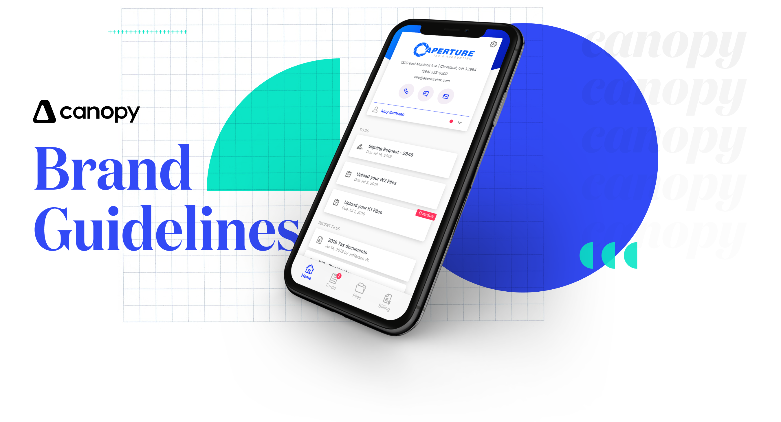

First, Let’s Talk About Why Brand Matters
A brand is an equation made up of two things: your identity (who you are) + your story (what you stand for).
For the purposes of this brand book, we'll mostly stick to the identity side—logo, colors, fonts, imagery, iconography, voice, tone, details—but have also included elements of story (like the Canopy values above) and will add this massive, hulking asterisk: EVERYTHING IS BRANDING.
"Everything?" you scoff. "Yes. Everything." Marketing, as expected, but also sales, product, support, print, events, websites, landing pages, handshakes, the lobby, innovations, emails, t-shirts, stickers, trade shows, social media, Glassdoor, LinkedIn, Reddit, the bathrooms, the breakroom...everything.
Every single point of contact between Canopy and our audience is branding. Which means, no pressure, but every single interaction either builds or destroys brand equity.
So, yes, brand matters. A lot.

Our Visual Identity
Yes, a company can have a personality—a look, a feel, a style, a distinct way of talking. It exists so people have something they can relate to when they interact with Canopy.
Canopy’s personality is fresh, confident, conversational. That should reflect both in our design (the visual identity we'll outline right now) and the way we talk (the voice & tone section, coming soon).
These guidelines aren’t meant to restrain creativity, but to steer it and make sure it's consistent. The more consistent we are in our design and messaging, the stronger and more recognizable our brand. It's simple, really. We just need to stick to it. Here are some examples of what the Canopy brand looks like visually. We'll dive deeper into the details—logo use, typography, color, etc—below.
